kubelens: a visual map and control panel for Kubernetes
The source is on GitHub: jialinhuang00/kubelens.
kubectl get all -A gives you everything. 800 lines. Every resource listed, nothing connected. You still don't know why staging keeps restarting, which Secrets istiod depends on, or what shares a ServiceAccount with something it shouldn't.
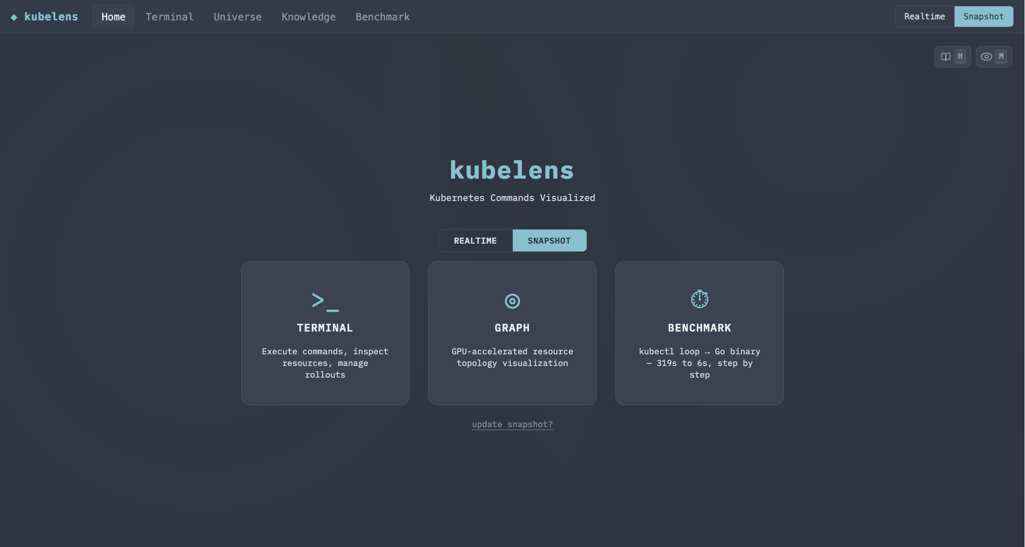
The problem isn't "what exists." It's "how does this connect to that." That's a visual problem. kubelens is the visual answer: a graph of the whole cluster plus a multi-window terminal, working against a live cluster or an offline snapshot.
The graph
The Universe view renders the entire cluster as a force-directed graph on a single WebGL canvas. 820 resources, all namespaces, one pass. DOM nodes couldn't handle the scale. Every pan froze the browser. So it's WebGL.
The edges are the point. Each one is a real dependency the backend extracted from the specs: a Service to the Deployment it selects, an HTTPRoute up to its Gateway and across to its backend Service, a workload down to the ConfigMaps, Secrets, PVCs and ServiceAccount it mounts, a RoleBinding to its Role, an HPA to the workload it scales, a Pod to the workload that owns it. Click any node and the sidebar shows that whole connection map. At 3x zoom a gateway's four connections are right there.
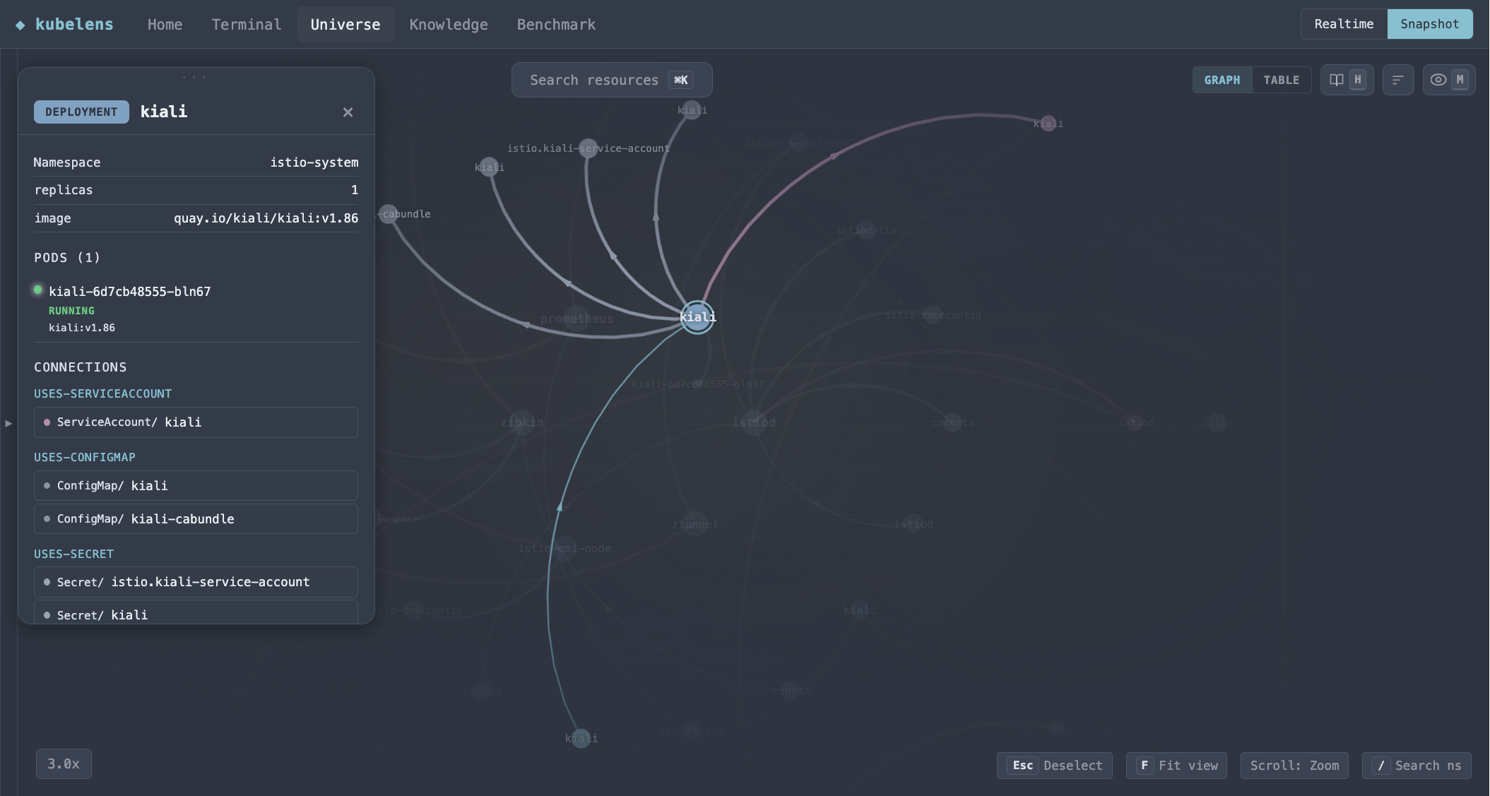
You can focus a single namespace, fuzzy-search across everything with Cmd+K, or flip to a table view that lists a kind's incoming and outgoing links instead of drawing them.
The terminal
The graph shows structure. The terminal shows state.
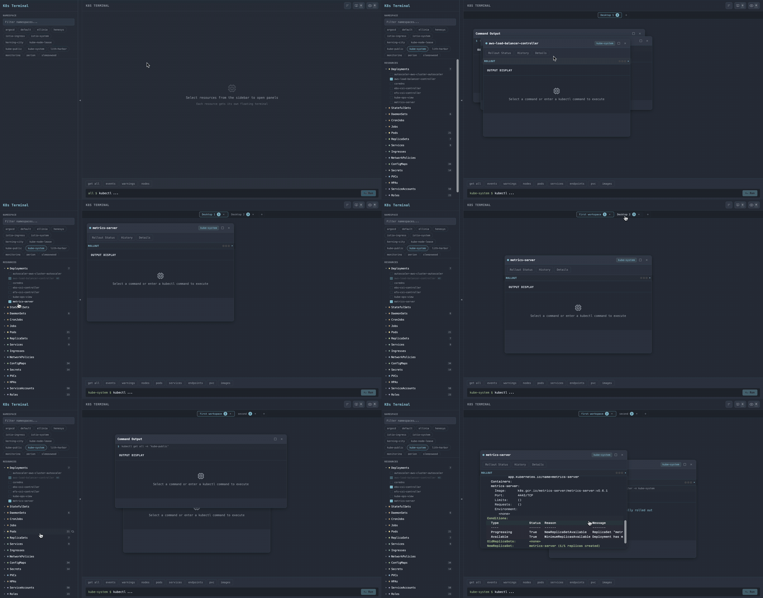
Take a Deployment. Its window opens onto a rollout panel: Rollout Status, History, Details — the questions you actually ask mid-deploy, as buttons instead of flags to memorize. Hit Rollout Status and it streams live over a WebSocket until the rollout settles. The buttons are per-kind: a Pod gets Logs and Exec Shell, a Secret gets one-click Decode, a workload gets Scale. Each window knows what you can do to the thing it's showing.
Open as many as you want, side by side: a deployment's rollout next to a Job's YAML next to a pod's logs — across desktops you can rename and drag windows between. kubectl can do all of this; it just costs you four panes and four commands.
Live or offline
There are two data modes, toggled per request. Realtime runs real kubectl against the cluster. Snapshot reads exported YAML files instead. No cluster needed.
Snapshot exists because dev clusters shut down at night. One command dumps every resource type across every namespace to disk (several export strategies ship: plain bash, Node sequential, worker threads, child processes, Go). After that the app emulates kubectl get and describe straight off the files, so you can keep investigating a cluster that's asleep.

It adapts to your cluster
Early on, the kinds it could draw were a hardcoded list: about twenty, plus ArgoCD's Application because that's what my cluster ran. Clone that onto a cluster with Istio VirtualServices or Cilium policies and the app simply doesn't know they exist.
So now it runs kubectl api-resources on first load and finds what your cluster actually has. The kind list lives in a kubelens.config.yaml you can edit, and whatever discovery turns up layers on top of it. One source of truth that the tree, the graph, and the offline snapshot emulator all read.
A real cluster has 80-plus kinds, though, and most are noise: leases, endpointslices, internal plumbing nobody opens. So there's a visibility panel: a VS Code-style matrix with every kind down one side and "show in tree / show in graph" checkboxes across the top. You pick. Flipping a box filters what's already loaded. No refetch, the graph doesn't even re-simulate.
Not locked to one cloud
Image-tag lookups used to be welded to AWS: ECR hardcoded, a literal \.dkr\.ecr\. regex in a component. That's an adapter now: it reads the registry from the image URL and calls whichever CLI matches (aws, gcloud, az), so GKE and ACR users don't hit a 404 the moment they click Load Tags.
The graph reaches one step past Kubernetes too. A LoadBalancer Service that terminates TLS with an external cert (an AWS ACM ARN named only in an annotation) shows up as a Certificate node, so the place your TLS actually terminates isn't invisible just because it lives outside the cluster.
The knowledge page
A separate reference view explains how the pieces relate: for each kind, which fields create which edges, what they mean, and an example. It's the legend for everything the graph draws.
What it doesn't do
No CPU/memory metrics. No multi-cluster switching. No RBAC management. These aren't missing features. kubelens is for understanding a cluster, not operating one. k9s is for power users who live in a terminal. kubelens is for the moment you need to see the whole picture, or explain what's running to someone who doesn't know kubectl.